Acerca de
TYPEFACE DESIGN

THE INSPO:
I thought about what I admire in a typeface: strong stems, serifs, variance in weight, and curvilinear strokes. Then, what I admire about writing. Ever since I learned cursive in 3rd grade, it became my default. It's quick, seamless, elegant. I wanted to combine my admiration for strong serif fonts and the art of cursive handwriting.
THE PROCESS:
- Created stems, arms, and feet in Adobe Illustrator
- Imported letterforms into Procreate
- Drew lines to create finished letterforms
- Tested using the word "Typography."


IDENTIFYING THE PROBLEM:
Placing letterforms one-by-one created uncomfortable disconnects from letter to letter. This time, I imported "Typography" with the gaps into Procreate. I drew lines on individual letters and continued a single line through multiple letters, which created a more fluid look.


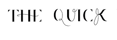
INTRODUCING ESTRAY


ABOUT THE TYEPE:
Estray was designed by Kaili JiMei in Novemer 2021. It combines the designer’s admiration for strong serif fonts with her personal cursive handwriting. Stems, arms, and feet represent the starting foundation of the letterforms. The letterforms come to life with the swift, curvaceous strokes of a technical ink brush, stringing letters together for legibility.


DRAKE MAG: EDITOR IN CHIEF
INFORMATION KIOSK: UX / UI DESIGN